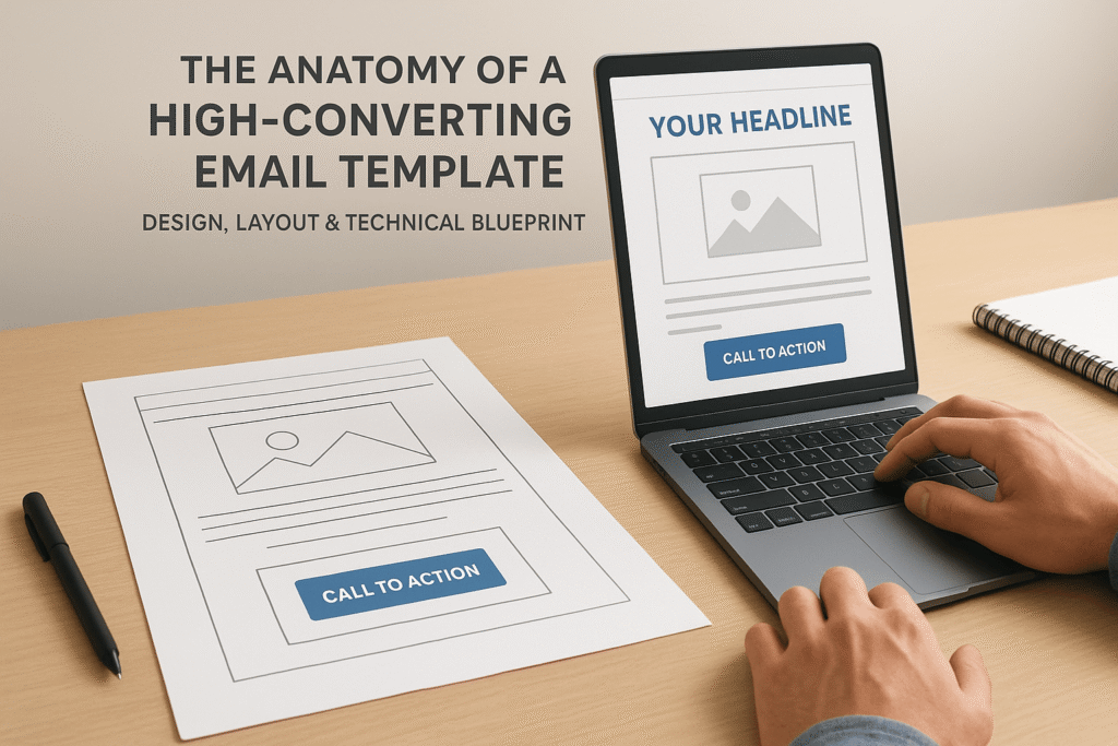
The Anatomy of a High-Converting Email Template: A Deep Dive for Email Marketers

It Started with a Failed Launch
Maya was an experienced email campaign manager at a mid-sized SaaS company. Her team had just spent weeks crafting the perfect offer — a generous free trial, segmented audience, A/B-tested subject lines. Yet, when they launched the campaign… crickets.
Open rates were decent, but conversions? Abysmal.
Frustrated, she did a post-mortem and realized what many overlook: the email design itself — its layout, visual hierarchy, CTA placement, and mobile responsiveness — was disjointed, slow to load, and not optimized for engagement.
This article is for every Maya out there — email marketers, copywriters, and campaign builders who need more than “use a catchy subject line.” Let’s decode the anatomy of a high-converting email template — not the fluff, but the design and technical structure that drives results.
1. Why Design Matters More Than You Think
Design isn’t just aesthetics. It dictates how users interact with your email — what they read first, how they scroll, and what they click.
According to Litmus, 60% of users will delete an email if it’s poorly formatted on mobile.
Another study by Campaign Monitor found that emails with a clear structure (visual hierarchy, whitespace, scannability) see up to 58% higher click-through rates.
2. Key Structural Components of a High-Converting Email Template
Let’s dissect the technical and visual elements, layer by layer.
1. Header: The First Impression
Your header sets the tone. It must load quickly, be responsive, and give users a reason to keep scrolling.
What to include:
- Brand logo (linked to your homepage)
- Preheader text (the email’s “subtitle” in inbox previews)
Optional: Navigation bar (for newsletters or longer content)
Cognitive science alert: The F-pattern (how we scan left to right, then down) makes the top left quadrant the most valuable real estate. Place logos and CTAs accordingly.
3. Hero Section: Visual Hook
This is where engagement spikes or drops.
Use:
- A strong image or animated GIF to capture emotion or highlight the offer
- Headline with emotional + benefit-driven copy
- CTA button (visible above the fold)
Emails with a compelling hero image see 203% more engagement than plain-text layouts. [Source]
Pro tip: Avoid heavy image files — keep hero sections under 200 KB for fast load times.
4. Body Copy: Tell, Don’t Sell
Your goal here isn’t to convince — it’s to guide. Focused, benefit-driven text with crisp line spacing, short paragraphs, and visual cues (like bolding or icons) works best.
Formatting tips:
- Use a max of 2 font families for legibility
- Font size: 14-16px for body, 20-24px for headlines
- Align left for easy scanning
Neuromarketing tip: Using action-oriented words like “discover,” “unlock,” or “grab” activates the brain’s reward center more than passive phrases like “click here.” [source]
5. CTA: Your Conversion Trigger
This is not just a button — it’s the linchpin of your conversion strategy.
Best practices:
- Make it visually distinct (contrast color, generous padding)
- Use first-person copy (e.g., “Yes, I want my bonus” performs 90% better than “Get the bonus” [source])
- Only one primary CTA per email — no decision fatigue
- CTA placement: Once above the fold, once at the end (reinforcement loop).
6. Mobile Optimization: The Conversion Multiplier
With over 81% of emails opened on mobile ([Litmus]), mobile responsiveness isn’t optional.
Checklist:
- Single-column layout
- Tappable buttons (minimum 44px height)
- Responsive images (set max-width: 100% in CSS)
- Test on both iOS and Android email clients
Tools like Email on Acid or Litmus help test across 90+ combinations of clients/devices.
6. Footer: More Than Just Legalese
A strategic footer can boost brand trust and reduce unsubscribes.
Include:
- Contact information
- Social links
- Manage preferences + unsubscribe options
- Bonus: Add a soft CTA or link to a blog/resource
Email deliverability tip: Make sure your footer includes your physical business address to comply with CAN-SPAM and improve trust signals.
7. Technical Must-Haves Behind the Scenes
Design is just one side. The template’s backend code and configuration can make or break deliverability and loading speed.
a) Clean HTML & Inline CSS
- Avoid deprecated tags and external stylesheets
- Keep code under 102KB to prevent Gmail clipping
b) ALT Text for All Images
- Not just for accessibility, but also because 43% of email clients block images by default. ALT text ensures your message is still conveyed.
c) UTM Tracking & A/B Testing Hooks
- Add UTM parameters to every CTA
- Use variables for testing subject lines, hero image versions, or CTA copy
8. Real-World Example: Netflix’s Email Layout
Netflix’s retention emails are a masterclass in minimalist design:
- Logo top-left, clean hero image
- One headline, one CTA: “Continue Watching”
- Simple, mobile-first layout
- Footer with personalization (“Based on your preferences”)
Result: Consistently high engagement without feeling “salesy.”
9. How You Can Apply This as an Email Marketer
If you’re an email campaign creator or copywriter, here’s how you can implement this:
- Use modular templates: Create reusable blocks for hero sections, body content, and CTAs to streamline production.
- Design before you write: Start with wireframes. Align copy to the visual flow.
- Run heatmaps: Tools like Mailmodo and Crazy Egg for email can show where people click or drop off.
- Benchmark every version: Compare layout types (Z-pattern vs. single-column) across campaigns.
Conclusion: Great Email Design Isn’t Art — It’s Engineered
A high-converting email template isn’t about bells and whistles. It’s about structure, intention, and psychology. From header to footer, every pixel and line of code should serve a purpose: guiding the reader toward action.
If your campaigns are underperforming, don’t just rewrite the copy or tweak the subject line — rebuild the anatomy.
So, what part of your email design will you optimize first?
You now have a blueprint for designing high-converting email templates. True mastery comes from understanding the mindful marketing principles that make those designs resonate. This isn’t just another textbook; it’s a visual journey through the frameworks and psychology that define modern marketing. Pair your design skills with strategic depth. Make marketing mindfully simple. Get your copy here.
Related Posts
Email Automation Workflows: Templates for Every Stage (Free Examples)
The Power of Storytelling in Email Marketing: How to Connect & Convert
The Psychology Behind High-Converting Email CTAs: Power Words That Drive Action
Drip Campaign vs Newsletter: Which Email Strategy Converts Better in 2025?

